
PHILOSOPHY
From idea to concept and implementation
As creative people, when building a brand, we consider the main ingredients that are found in its vision and try to translate them into visual elements. Sometimes these stories can be transmitted pure state, while in other times they need a nice package, so that the result speaks everybody’s language.
„FapteVerzi” (translated: Green Deeds) is the brand closer to people and nature. Is the brand that fights for the community it belongs to, helping people to become better. It is a social brand thatdoes not need hidden advertising, just someone to tell its pure story. The brand values such as responsibility, commitment and empathy arise from the work done by the team behind the brand. The creativity and integrity come to complement these values, to highlight the artistic spirit as well as the basic principle behind a social brand”.
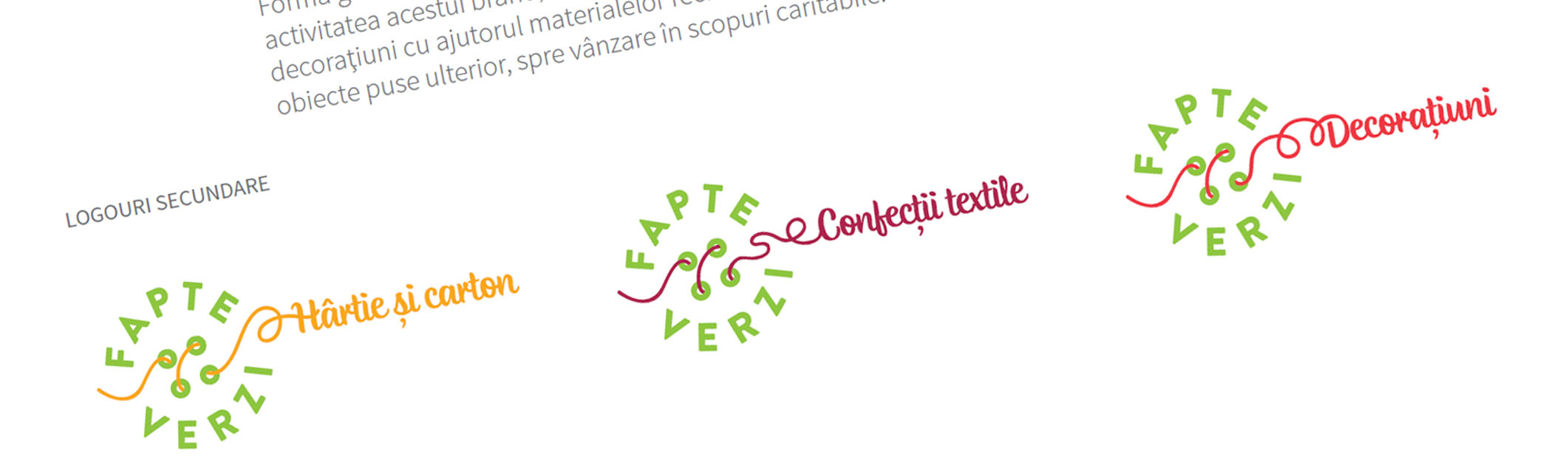
The logo consists of several elements, which together sketch the image of “FapteVerzi” – the circular shape reminds of recycling, cyclical and is a perfect shape. The colors are a contrasting and cheerful combination –the shade of green making direct reference to recycling, ecology and nature, and the orange accent representing keywords like: vivacity, energy, optimism, confidence.
The element that refers to a sewed button is thought to make the connection with the idea of personalization and making things with not only manually, but also with soul dedication. The result speaks of the confidence and optimism that we felt in our collaboration during this project, elements without which we could have not achieved something memorable.
authors: Tib Roibu & Alina Petrea